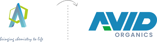
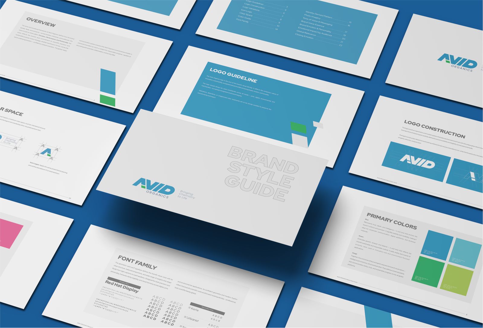
Avid
Organics

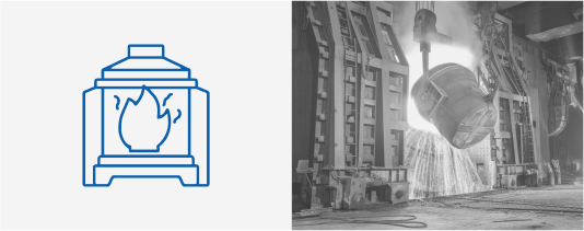
Industry
Chemical Intermediates
Scope
Rebranding
Extended Identity
Spatial Design
Global Communication
Organics
Industry
Chemical Intermediates
Scope
Rebranding
Extended Identity
Spatial Design
Global Communication
The Brief
Specialty intermediates, performance molecules, products that quietly power industries across the globe. Avid has been doing it all. Yet the brand was not
communicating it.
The internal culture is progressive, the science is world-class, and the sustainability conviction is genuine, but none of that was landing the way it should with
global partners, investors, and new markets.
The specialty chemicals sector is an industry where trust is not assumed, it is earned, over time, through every signal a company sends. A label on a packaging, a
slide in a boardroom, a booth at an international trade expo; each one either builds credibility or quietly erodes it. For Avid , the signals weren't coherent.
Technically excellent in the lab, the brand was under-communicating its identity everywhere else.
The ask was direct: make the world see Avid the way the people inside it already do. As a trusted, forward-thinking, and deeply responsible leader in chemical
innovation.
The Challenge
The existing visual and verbal identity lacked the global coherence that
sophisticated industrial buyers and investors expect. Communication varied
across touchpoints, print, digital, physical, making it difficult to build a
singular, credible impression. In high-trust industries like specialty
chemicals, perception gaps become commercial gaps fast.
One of the more complex challenges was building a tone of voice that could
be formal enough for an investor deck, human enough for a social post,
precise enough for a technical specification sheet, and warm enough for a
CSR report. These aren't just stylistic adjustments, they require
fundamentally different structural approaches to communication.
The Opportunity
Avid's audiences are five distinct groups, each arriving at the brand with
different needs and different filters. Industry partners want reliability and
technical excellence. Investors and stakeholders look for ESG alignment and
growth potential. Global customers need assurance of quality, traceability,
and consistency. Employees and collaborators want to feel pride and
purpose. And communities and consumers expected transparency and
environmental accountability.
Our Methodology
Every decision in this engagement was anchored in research, into the
industry, the audience, the competitive landscape, and the internal culture
of Avid itself. What follows is not a list of deliverables. It is a sequence of
decisions, and the thinking behind each one.
We began where all good strategy begins, with listening. Stakeholder
touchpoints, market analysis, and a thorough audit of existing brand
materials gave us a clear picture of the gap between how Avid saw itself and
how the outside world received it. The insight was precise: the credibility was
there. The communication system to carry it was not.
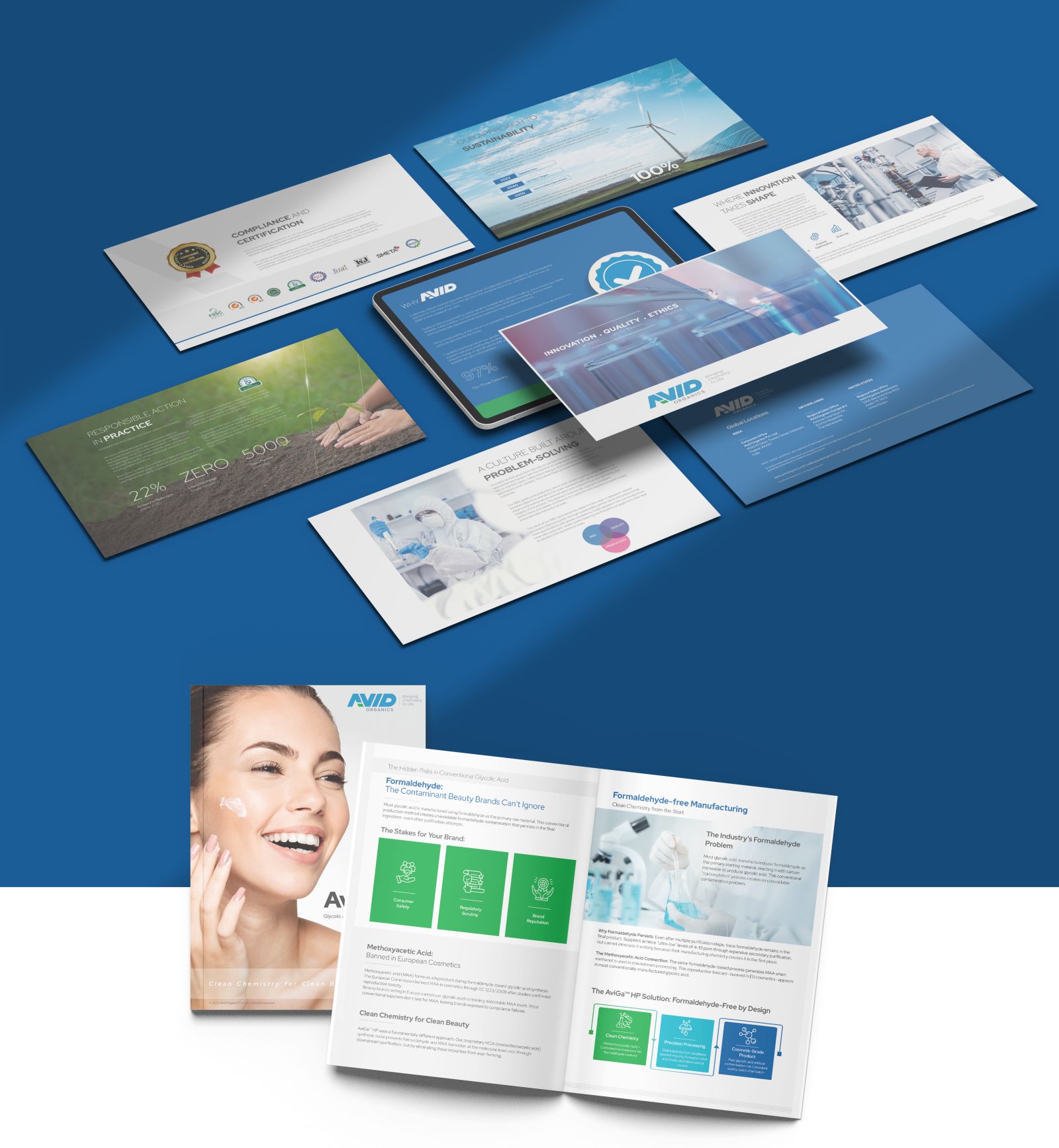
The Work
We built the brand on two pillars, intelligence and consciousness. and gave each a colour. Blue for scientific precision: cool, authoritative, anchored in trust.
Green for sustainable intent: organic, purposeful, alive. These are not decorative choices. They are structural ones, and the distinction matters.
The Identity
The logo's forward-cut letterforms signal
progress and direction, two qualities Avid
embodies commercially and ethically. The green
is the conscience of the mark, the moment where
the industrial gives way to the ecological.
Typography
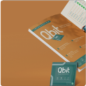
Typography was chosen for its geometric confidence and its global legibility. Every weight, every pairing, every use case was specified to
ensure that the brand's visual voice remained consistent whether it appeared on a business card or an exhibition structure.
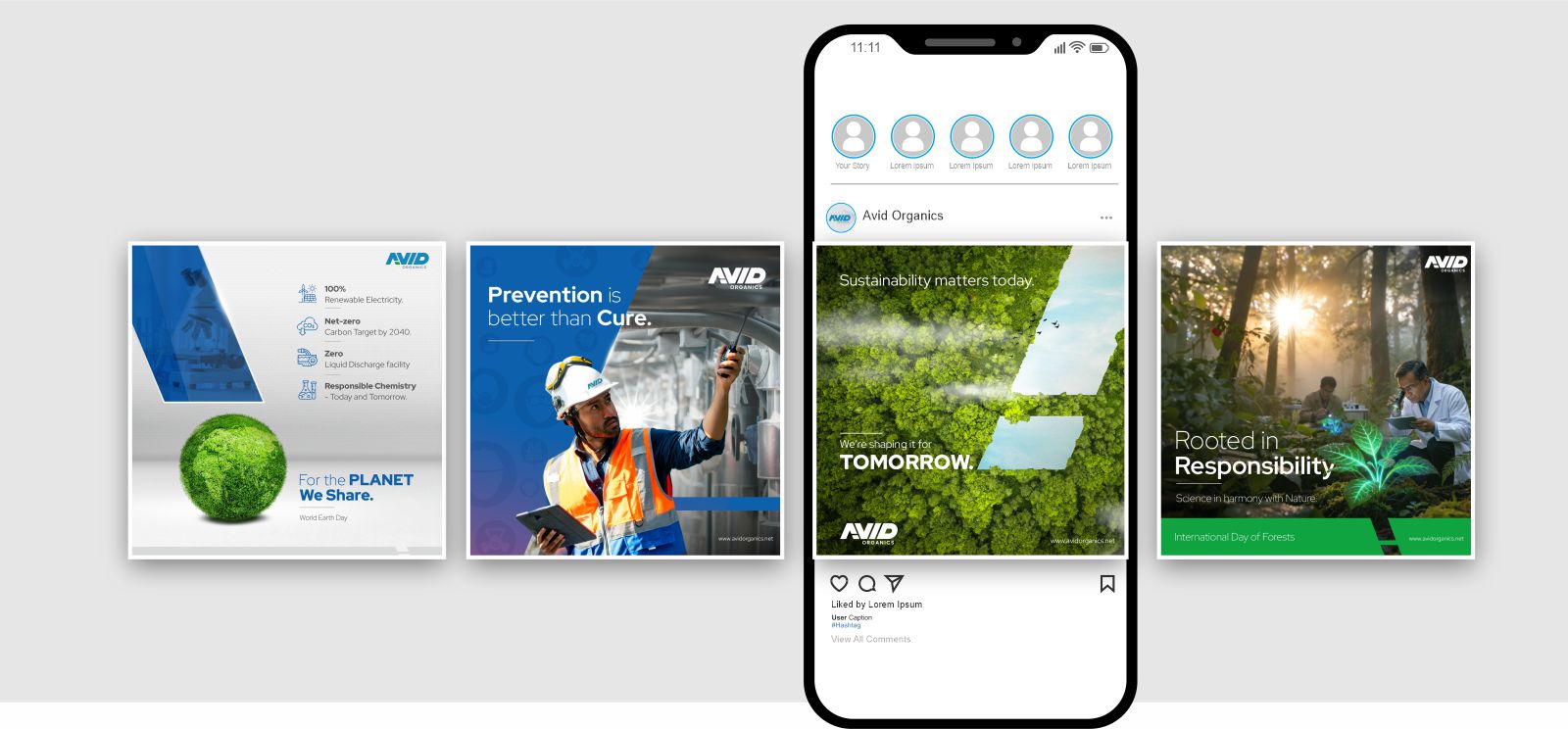
Global Messaging
We developed five distinct communication registers, each mapped to an audience and a context, but all drawing from the same emotional core: confident,
conscious, and catalytic. The brand's communication was made global-ready, clear, minimal, free of idioms, and equally translatable without losing its
character.
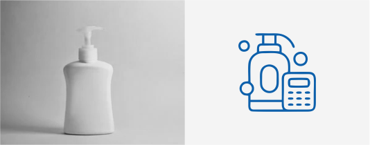
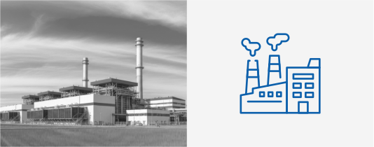
Iconography


UI/UX
Midway through the development of the digital communication system, it became clear that the initial UI/UX framework was prioritising aesthetic
coherence at the expense of functional usability for Avid's technical audiences.
We paused, went back, and recalibrated. The result was a design system that held the brand's visual identity with full integrity, but restructured the
information hierarchy to serve various users with specific relevance to each.
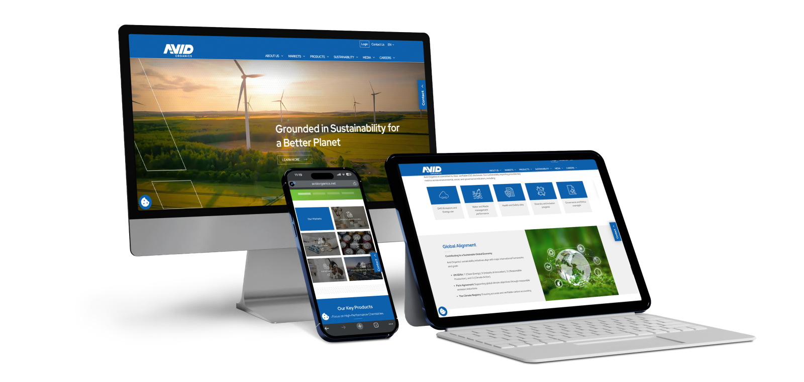
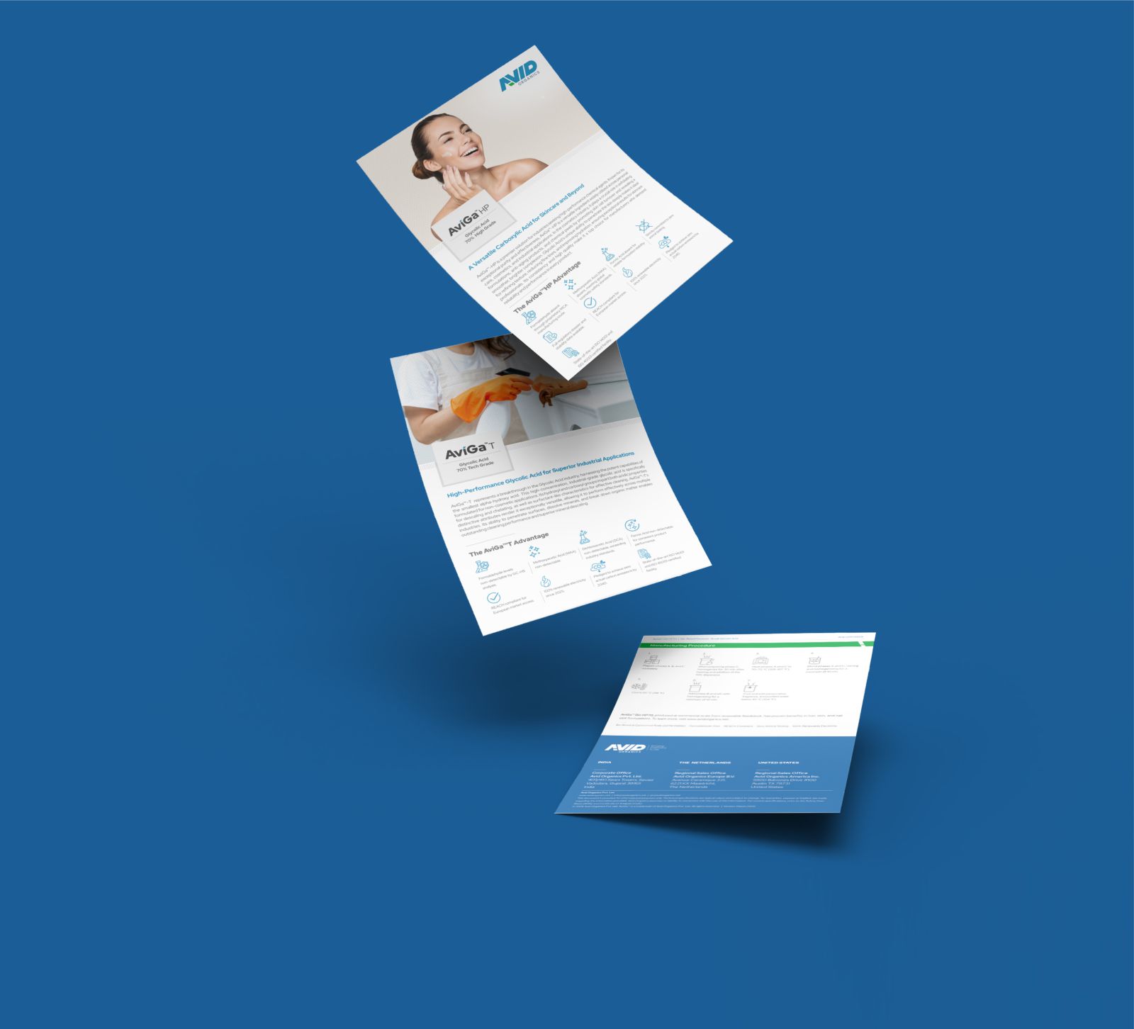
Strategy only earns its keep whn it's executed. We took the brand through every medium. UI/UX design systems, corporate and investor presentation
templates, video content for launch and social, campaign frameworks for digital platforms, and physical exhibition environments at both domestic Indian
trade events and international expos.
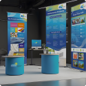
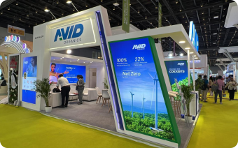
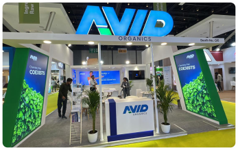
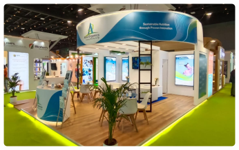
Expo Booths
The exhibition work deserves particular mention. Spatial branding at a specialist trade fair is where an identity faces its hardest test. It has to work at scale,
in a noisy environment, against competitors who have been at the same show for twenty years. The Avid booth, carrying the full weight of the new identity,
from the pattern system to the typography to the brand colour architecture, commanded attention and communicated a very specific message: this
company has arrived, and it means business.
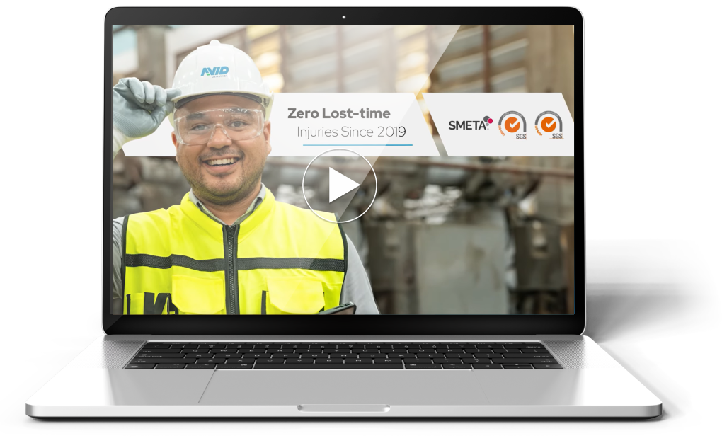
The Impact
At the first international trade event following the
rebrand, the Avid's presence drew measurably
more engagement, a function not of a larger booth,
but of a clearer, more confident, and global-ready
brand presence.
Internally, the response was equally significant. The
clarity of the new brand system gave teams across
functions a shared visual and verbal vocabulary.
Communication became faster, more consistent,
and more self-assured.
Conclusion
The chemical industry has long treated branding as an afterthought; something you attend to after the science is solid and the order book is full. Avid
represents a different thesis: that in global markets, your brand is your first conversation, your credibility signal, and your competitive edge, and often all at
once; when you are not present in the room and also when you are.
What we built together isn't a visual refresh or a communication upgrade. It's an end-to-end expression architecture. One that takes a brand rooted in
chemistry and projects it with the confidence, the clarity, and the consciousness it has always deserved, and the world can see it.